Mobile UX
Muve UK: conveyancing on a phone screen
Muve UK is a conveyancing firm. I designed the mobile experience for its website, aiming for a layout simple enough that someone in the middle of a house move can find what they need, or reach a person, without hunting through menus.
- Client
- Muve UK
- Role
- UX Designer
- Period
- 2023
- Tags
- work,mobile,web
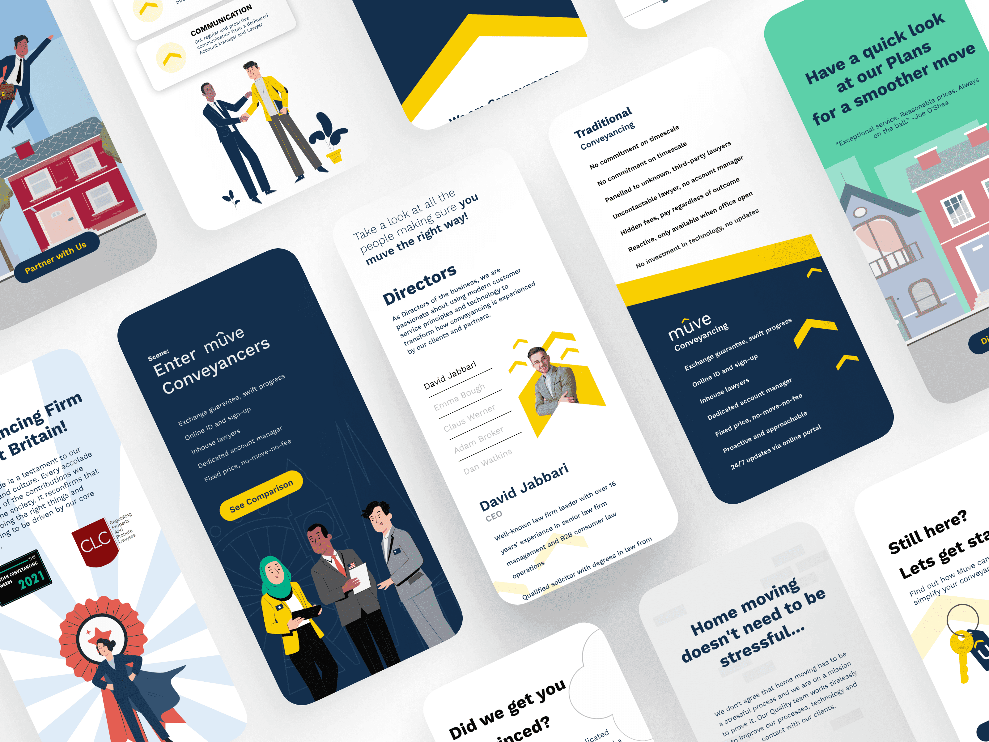
Most of the site's visitors are on a phone, and most of them are in the middle of something stressful. So the design is a single clean column: short sections, big buttons and plain headings that tell you where you are.
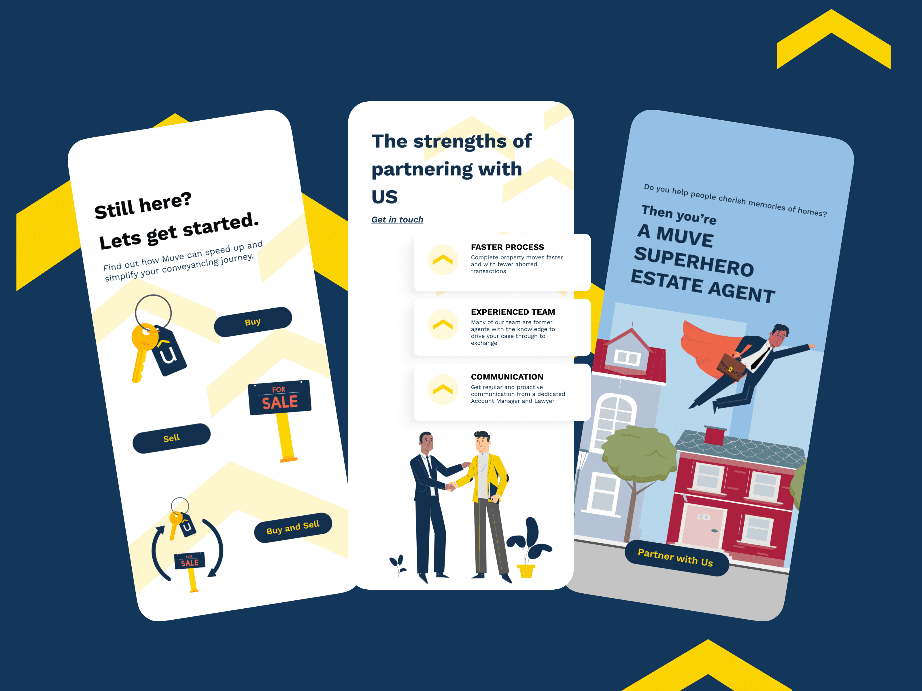
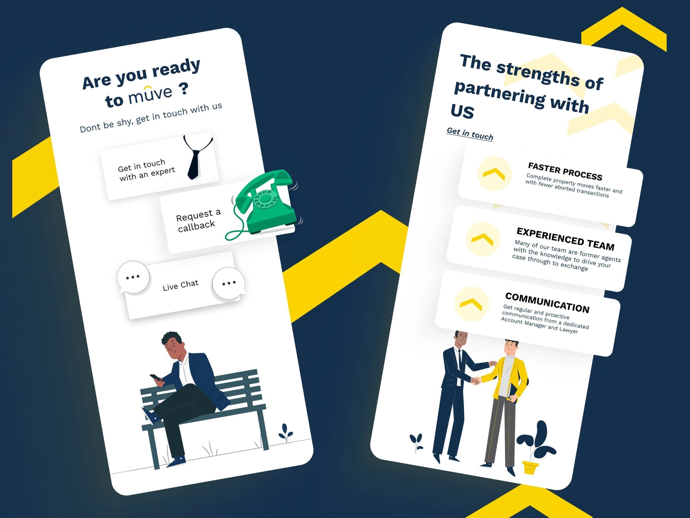
The first decision the site asks you to make is the one that matters, whether you are buying, selling or both, and every page keeps a way to reach a person close by: an expert, a callback or live chat.
1 / 2