Product Design
GetSig: e-signing without losing your place
GetSig is an Australian startup with a patent-pending way for businesses to sign documents electronically. When we looked at where its users struggled, the main obstacles came back to navigation: a dated, muted interface and a multi-step signing flow that never told you where you were. I led the team that redesigned the web app, on desktop and mobile.
- Client
- GetSig
- Role
- Lead UX/UI designer
- Period
- 2023
- Tags
- work,saas
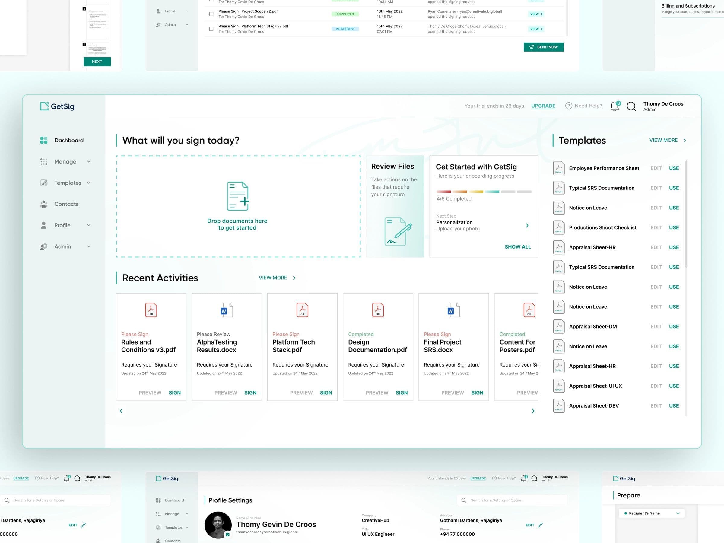
Sending a document for signature is never one step. You upload the file, choose who signs, place the signature fields, check it and send it. Each of those is a place to lose track, and an e-signature product only works if people trust it with their contracts.
My role: I led the team at CreativeHub that redesigned the GetSig web app, from the dashboard to the signing flow, on desktop and mobile.
What was getting in the way
The existing app looked dated, and its subdued palette made it hard to tell what mattered on a screen. Statuses, urgent requests and the next action all carried the same weight.
When we analysed where people struggled, the biggest obstacle was navigation. The clearest case was placing a signature: once you were inside a document, nothing told you how far along you were or what came next. For a product whose whole job is getting a document signed, that is the worst place to feel lost.
What I changed
A path you can always see
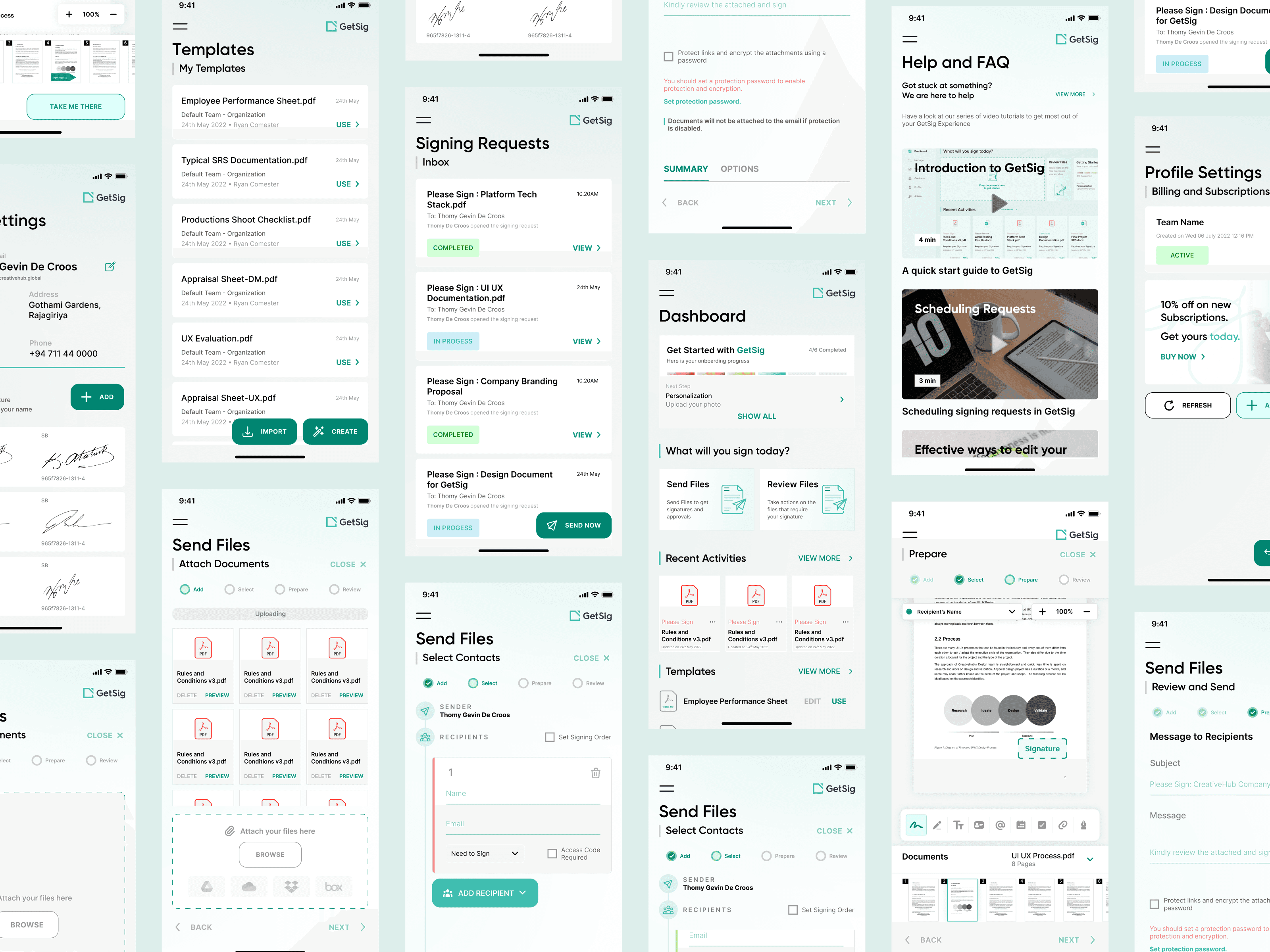
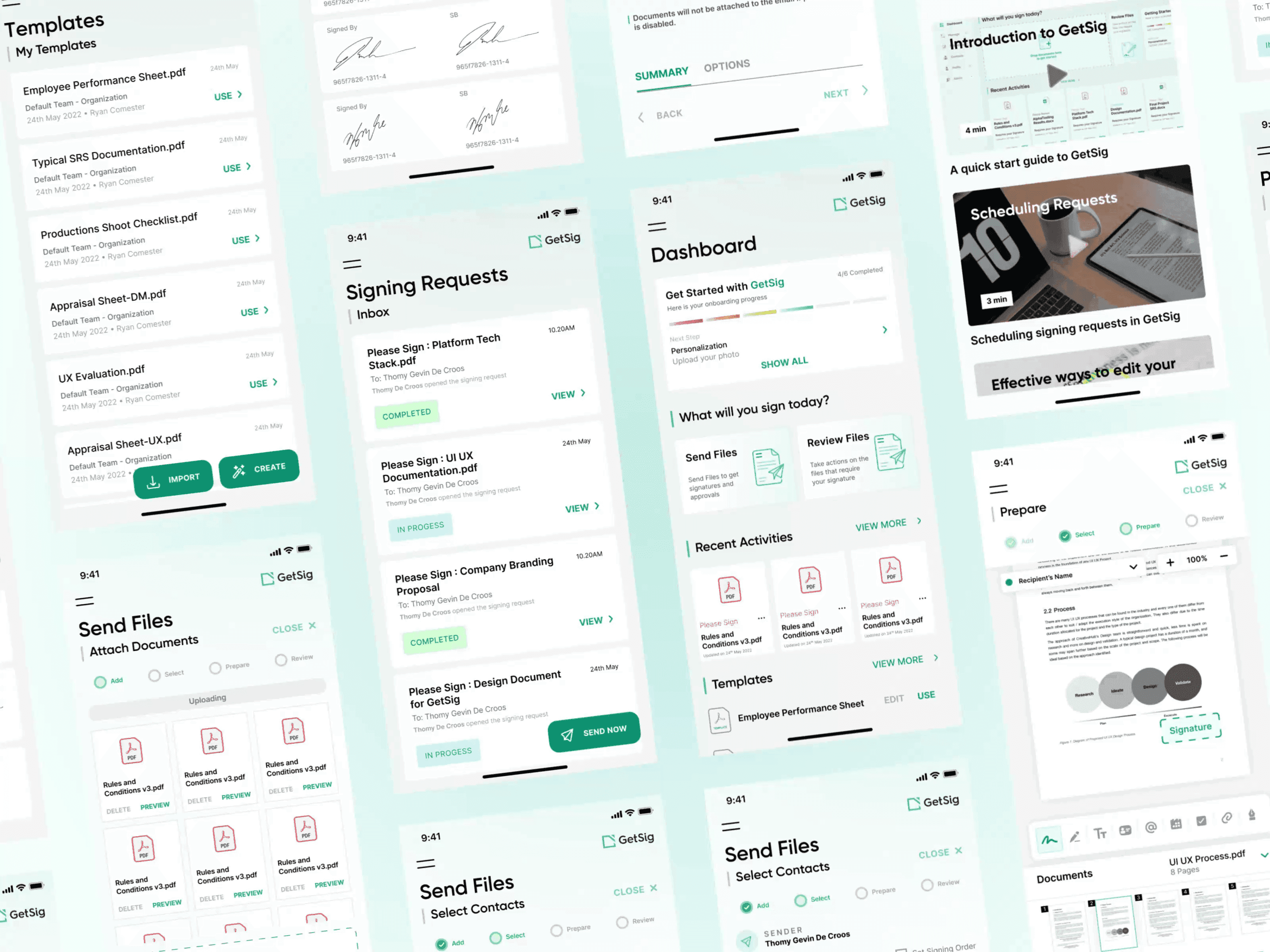
The send flow became four named steps: Add, Select, Prepare and Review. The current step is marked at the top of every screen, and Back and Next sit in the same place on each one. Prepare, where you drag signature fields onto the page, is where people used to lose their bearings, so the stepper stays in view the whole time you work on the document.
The same pattern runs on desktop and mobile, so the flow you learn on one is the flow you get on the other.
A dashboard that starts with the job
The dashboard opens on the two things people come to do: send something for signature, or deal with what is waiting for them. A quick glance shows how much is in the inbox, in drafts and sent. New accounts get a short getting-started checklist with a progress bar, and recent documents sit underneath as cards with their status and a Sign or Preview button.
Requests in a table, not a pile
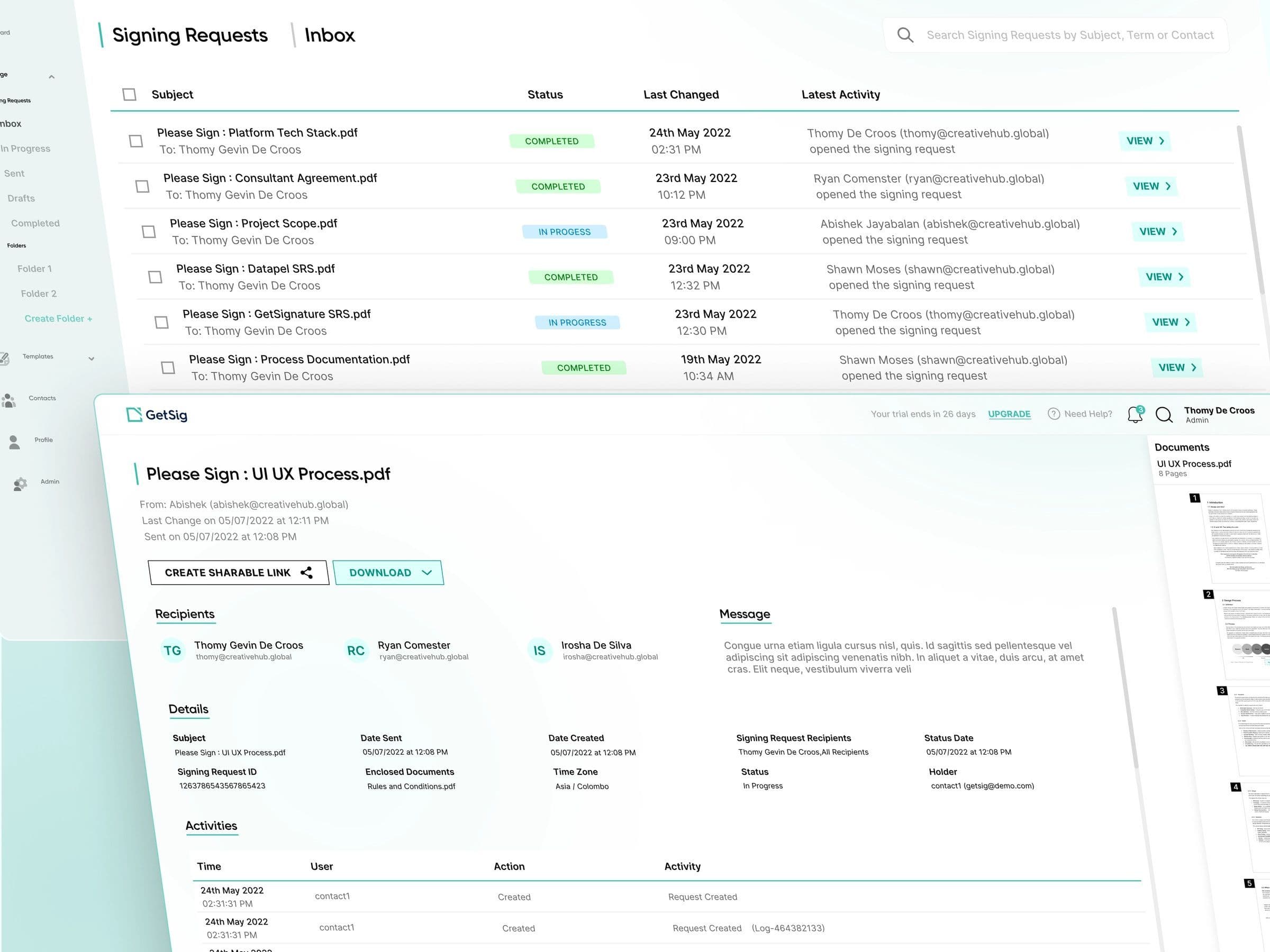
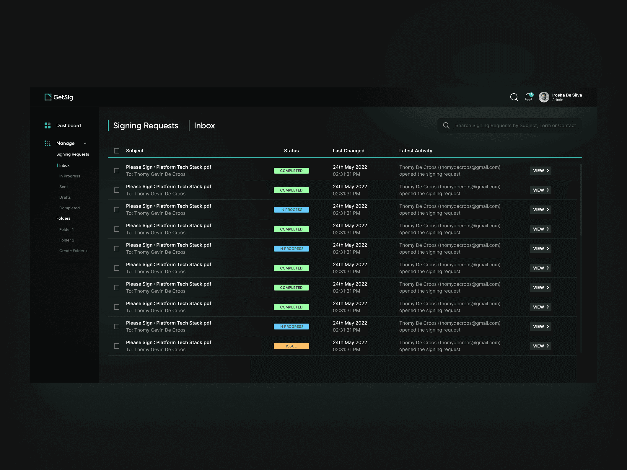
Signing requests moved into a table: subject, status, when it last changed and the latest activity, with search across all of it. Folders in the sidebar split them into Inbox, In progress, Sent, Drafts and Completed, plus folders people create themselves, so an urgent request does not get buried under finished ones.
Opening a request shows everything about it on one page: who it went to, the message, the details, a full activity log, and buttons to share a link or download the document.
Colour that means something
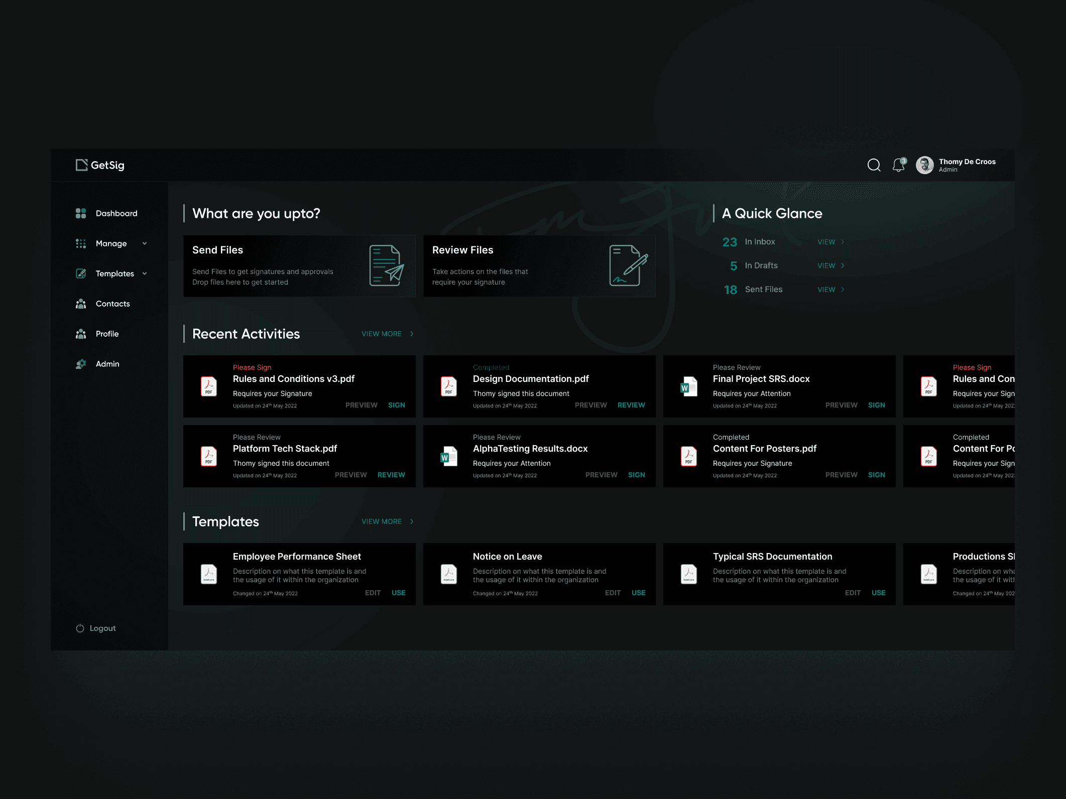
I replaced the muted palette with GetSig teal as the single accent for actions and where you are, and kept stronger colours for status tags. Completed, In progress and Issue now read before the subject line does. The dark theme uses the same components, so it is a choice for the person using it, not a second design to maintain.
The same app on a phone
People sign on their phones, so the mobile screens got the same attention as the desktop ones: the same four-step flow, the same dashboard, the same templates and requests, rearranged for one column and a thumb.
Help inside the app
A Help and FAQ section with short video guides, such as an introduction to GetSig and how to schedule signing requests, answers the common questions where they come up, instead of in an inbox.
The result
GetSig came out with one consistent layout across desktop and mobile, a signing flow that always shows where you are, and a dashboard that leads with the job people came to do. The navigation problem we found at the start is the thing every screen was designed around.