Product Design
UX of Datapel's Warehouse Management System
Datapel is a B2B warehouse management software (WMS) provider with an international clientele and headquarters in Australia. With features like real-time order and inventory insights, advanced stock lookup, order tracking, and integration with well-known accounting programs, their solution offers effective inventory and order management.
- Client
- Datapel
- Role
- UX Designer, Front-end Developer
- Period
- 2023
- Tags
- work, saas, b2b
Their challenges
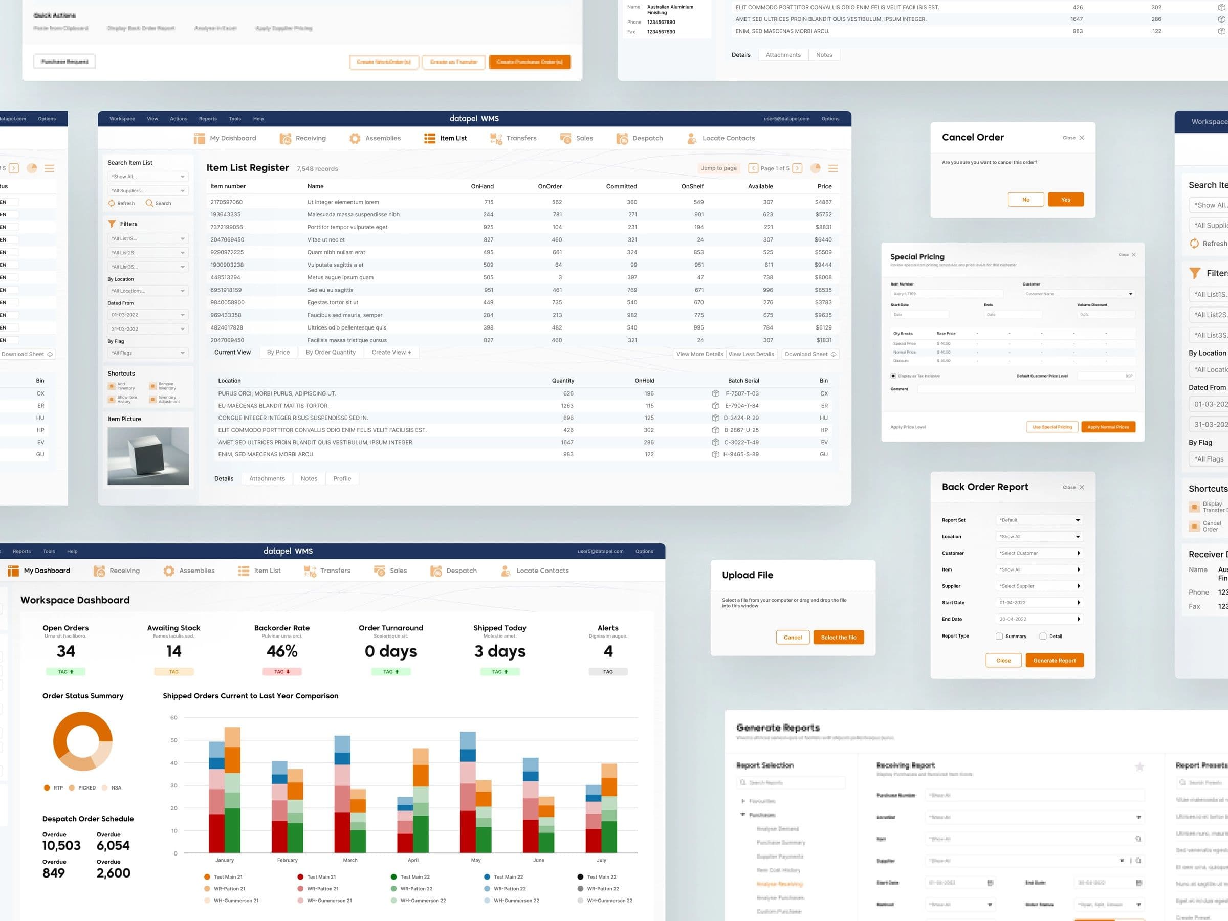
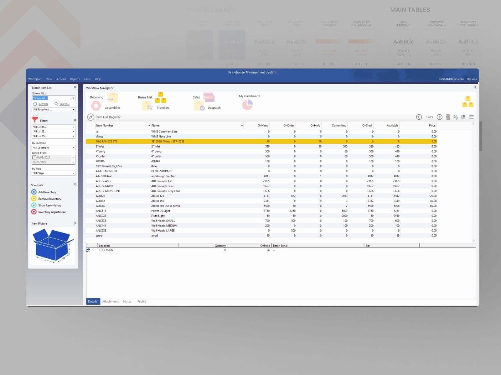
The Datapel B2B WMS UI was outdated, built on features, and required a modern, user-friendly inventory management system.
Inability to gather adequate reports and forecasting due to the lack of functionality. Limited visibility as a result of the absence of visual cues and emphasis placed on the distinct visual data indicators, and inconsistent access to reports.
The solution
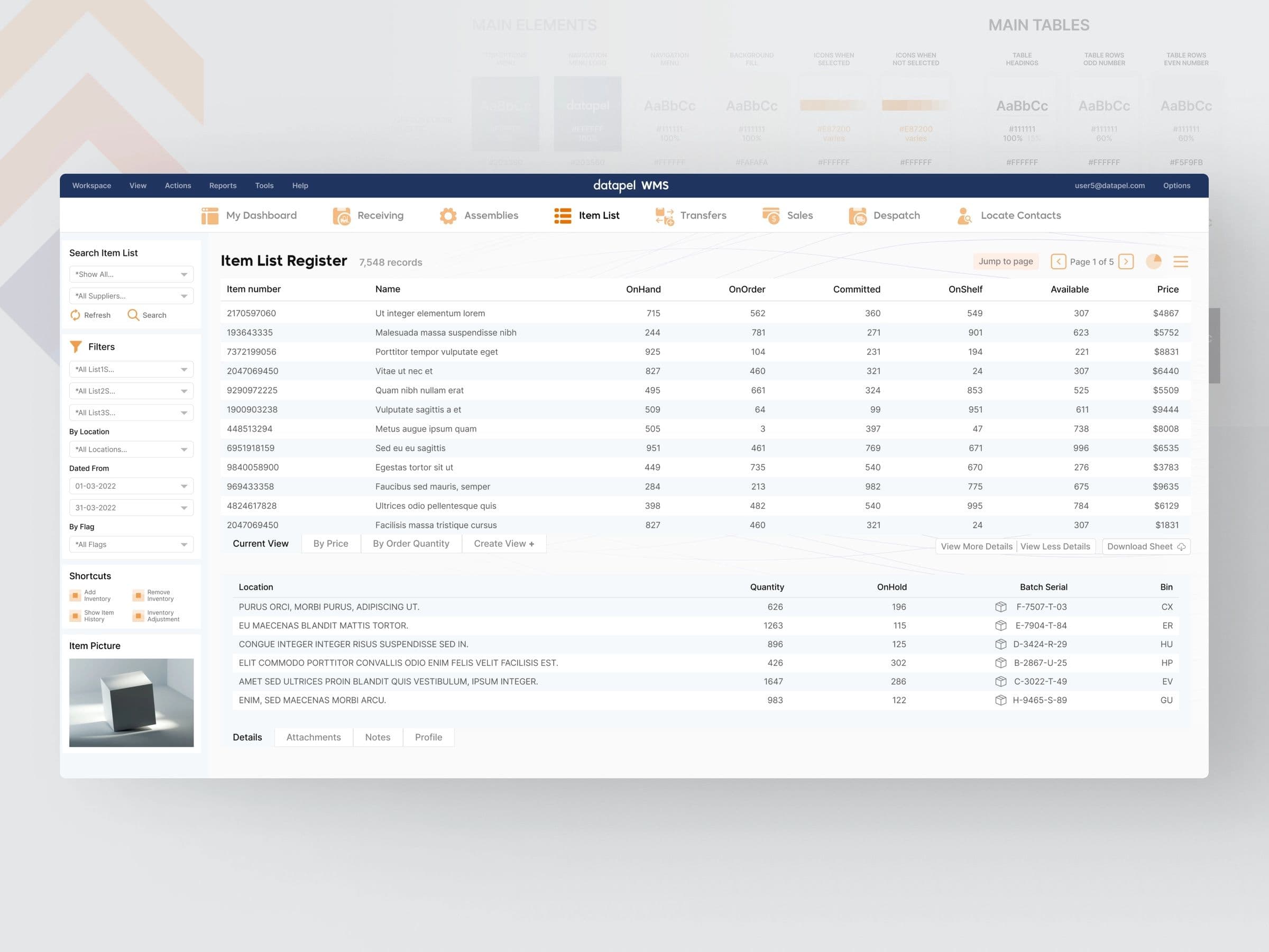
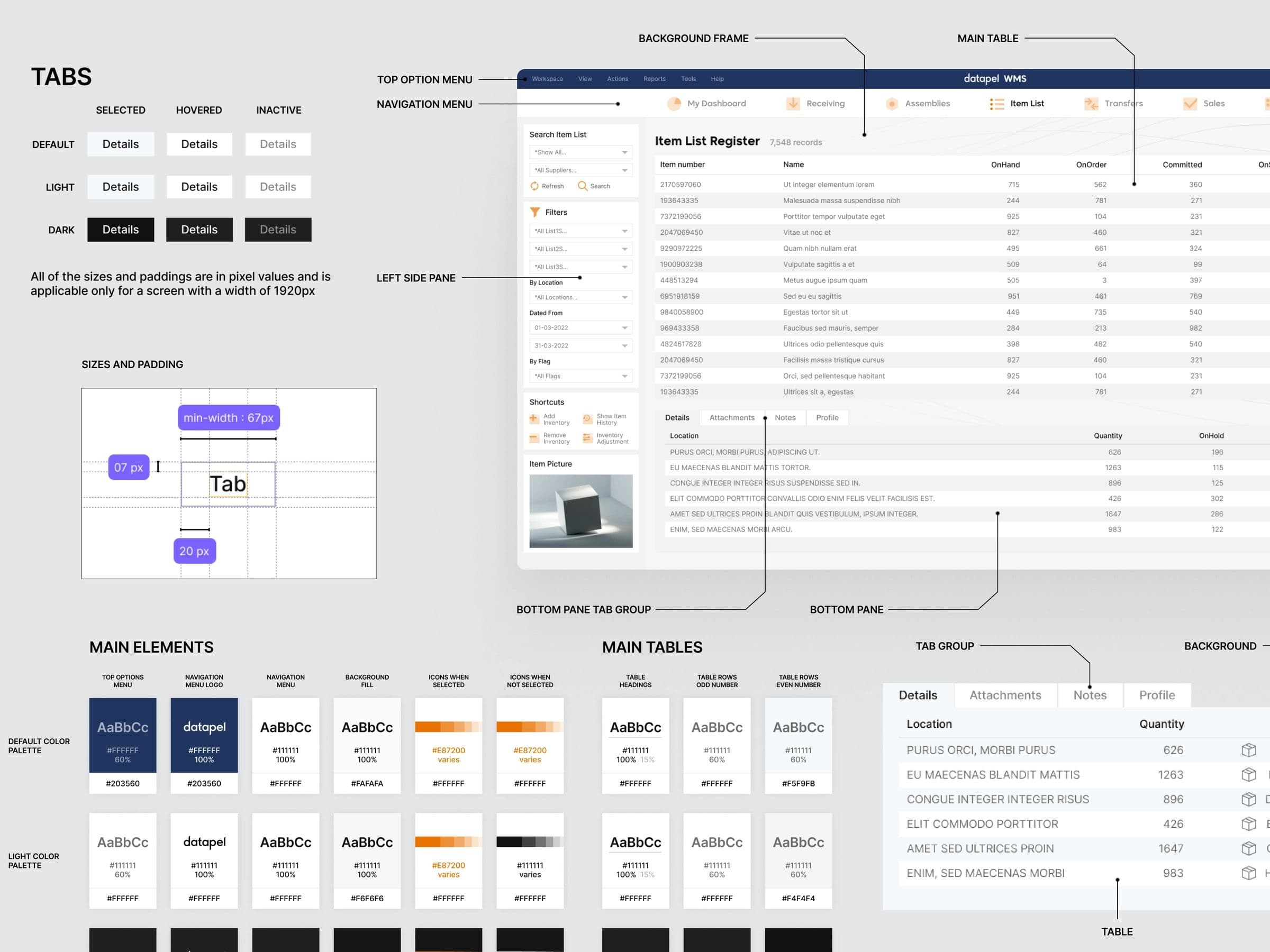
The solution incorporates better colour usage, making it easier for people to comprehend the design. The new system was developed to require less adaptation time and to provide more clarity around functionality.
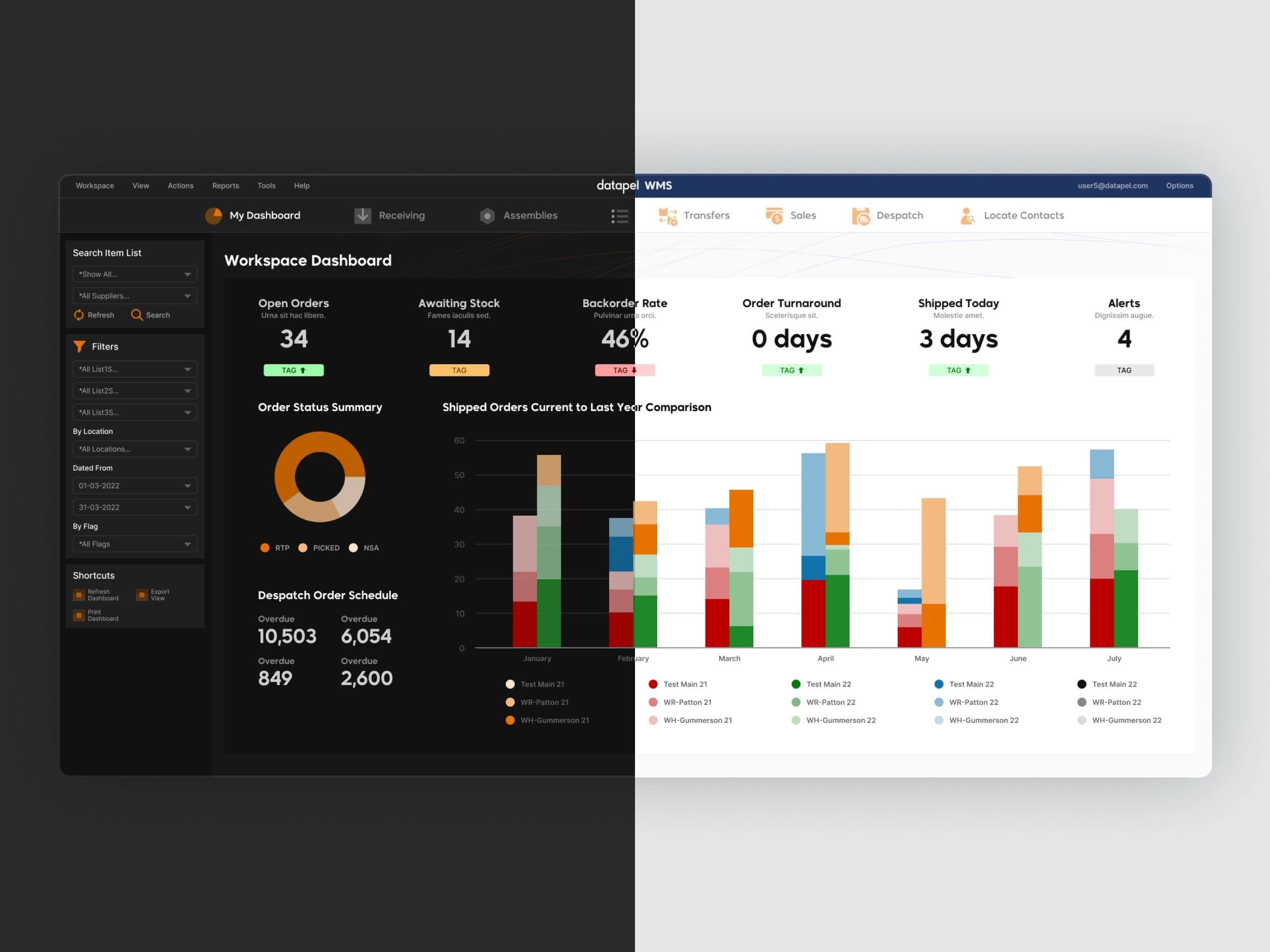
For the purpose of accommodating the user's preferences and comfort level, Datapel was designed incorporating both light and dark modes.
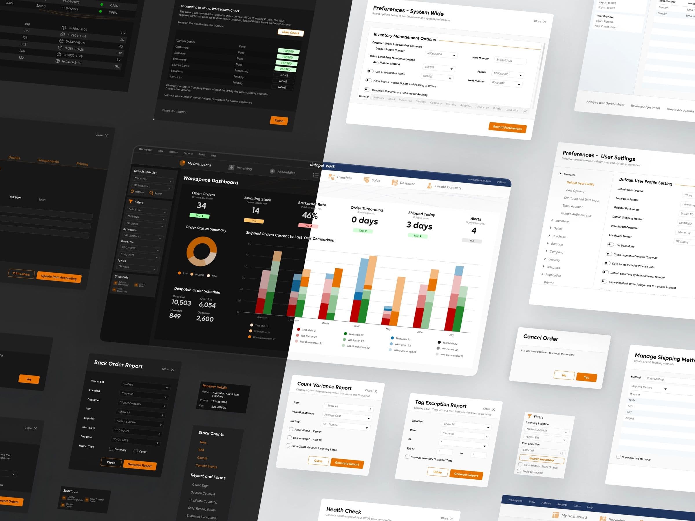
“The primary colour used throughout the system is Blaze Orange. In contrast, Admiral Blue has been used as the secondary colour.”
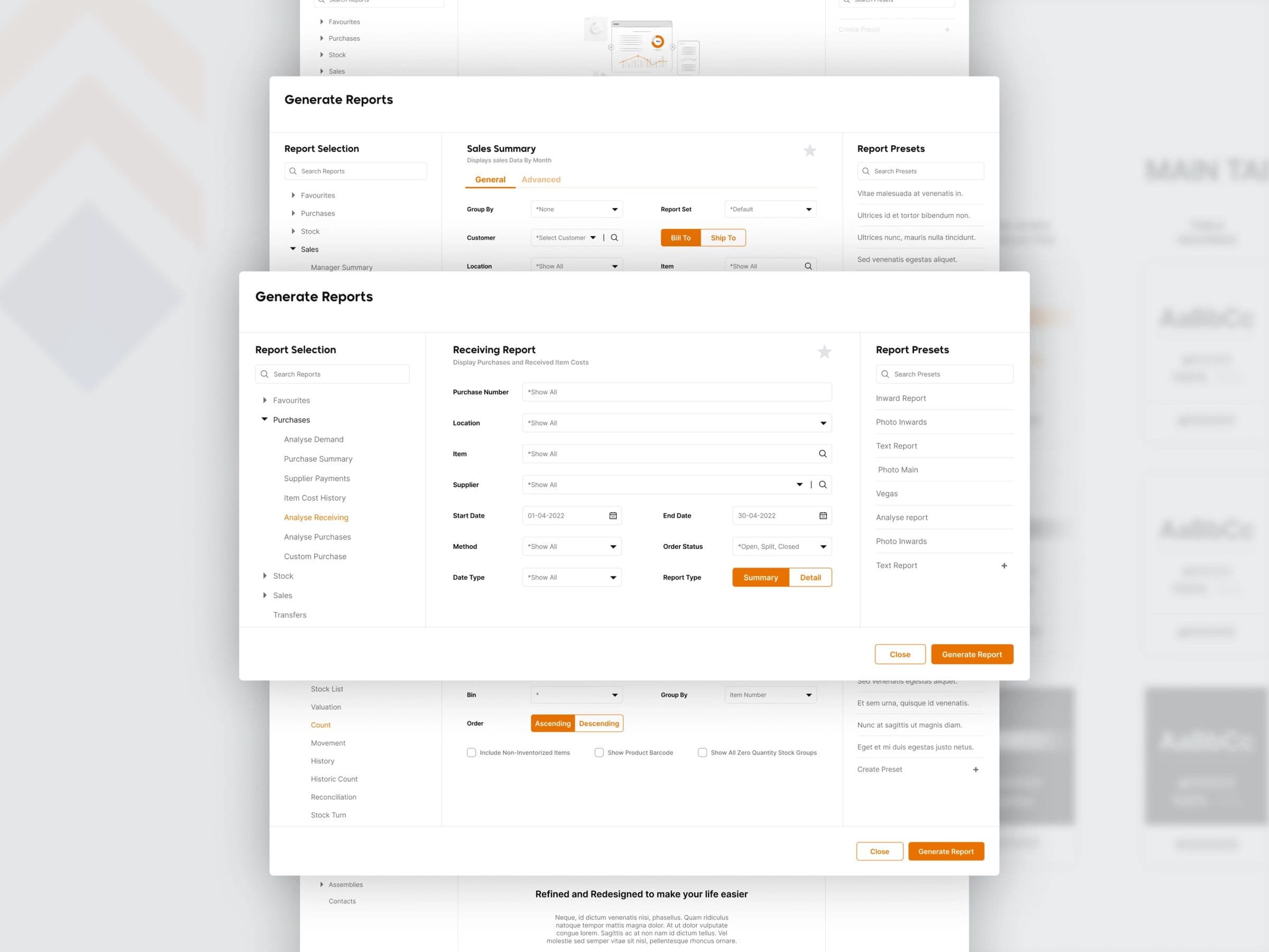
I focused on redesigning the report generation experience. Feedback from actual users shaped the navigation, flows and grouping of data within reports, resulting in a far more intuitive and streamlined process and a significant improvement in satisfaction and efficiency.