Web Design
Redesigning the Jaguar Car Club of Victoria website
The Jaguar Car Club of Victoria has brought Jaguar owners together since 1962. Its website has three jobs: tell members what's on, keep six decades of history and results, and bring new members in. I led the UI/UX team at CreativeHub that redesigned it, decluttering the navigation, splitting the calendar by event type and giving membership a clear way in.
- Client
- Jaguar Car Club of Victoria
- Role
- Lead UX/UI designer
- Period
- 2023
- Tags
- work,web
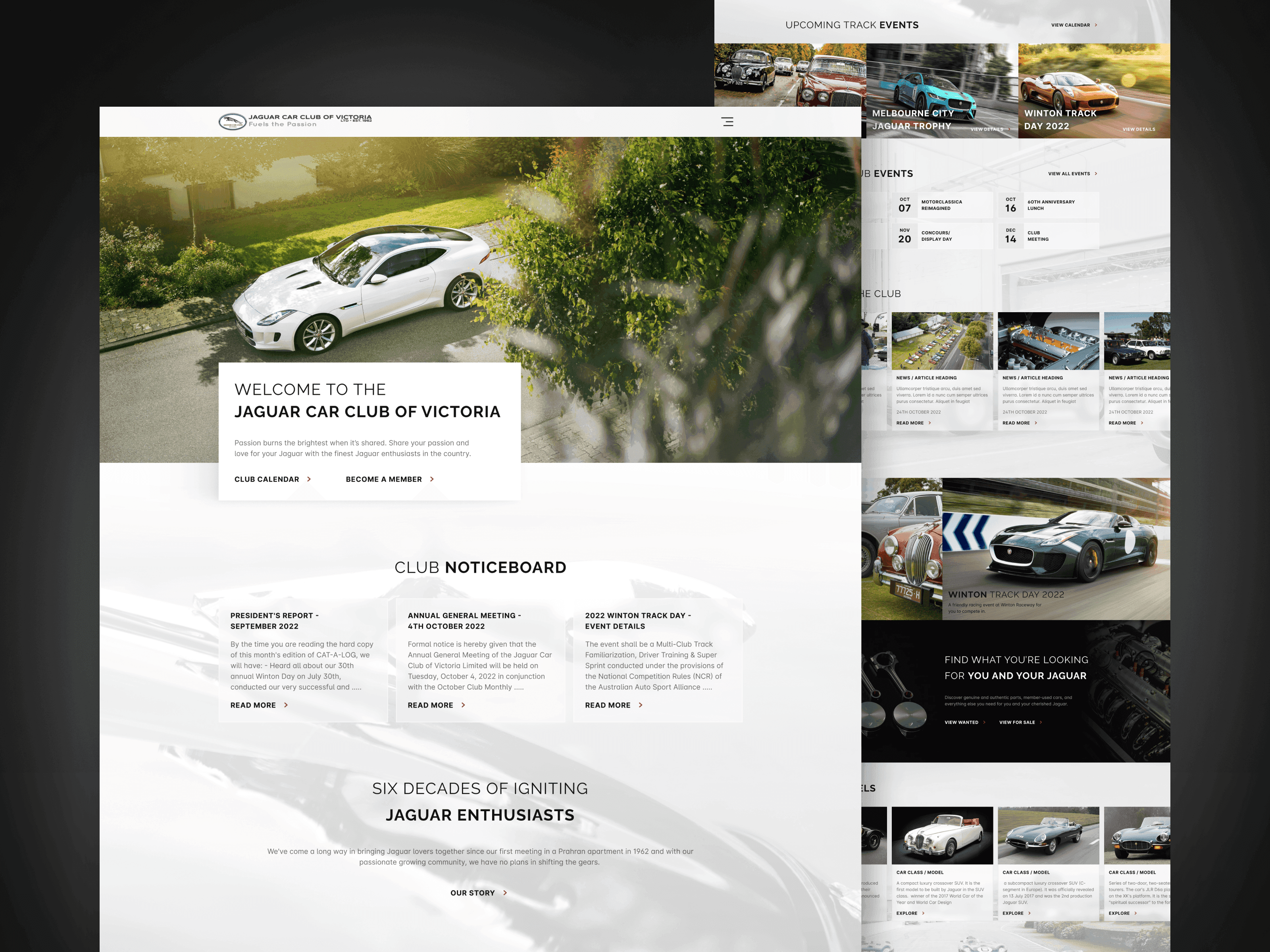
The club website serves two kinds of visitor. Members come back for the calendar, the noticeboard and the President's Report. Jaguar owners who are not members yet arrive curious, and need both a reason and a way to join. The old site made both of them work too hard.
What was in the way
- A crowded menu. Every section competed in one ungrouped navigation menu, so finding the calendar meant reading the lot.
- One calendar for everything. Track days and club meetings shared a single list, so someone after the next track day scrolled past AGMs and display days, and the other way round.
- No clear way to join. For a club that depends on new members, there was no obvious call to action for membership.
- Dead ends. There was no footer and no sitemap, so reaching the bottom of a page left you with nowhere to go.
And the people who use this site love Jaguars. It had to feel like one, with the bold, straight lines and careful proportions of Jaguar's own design, without that ever getting in the way of finding Thursday's meeting.
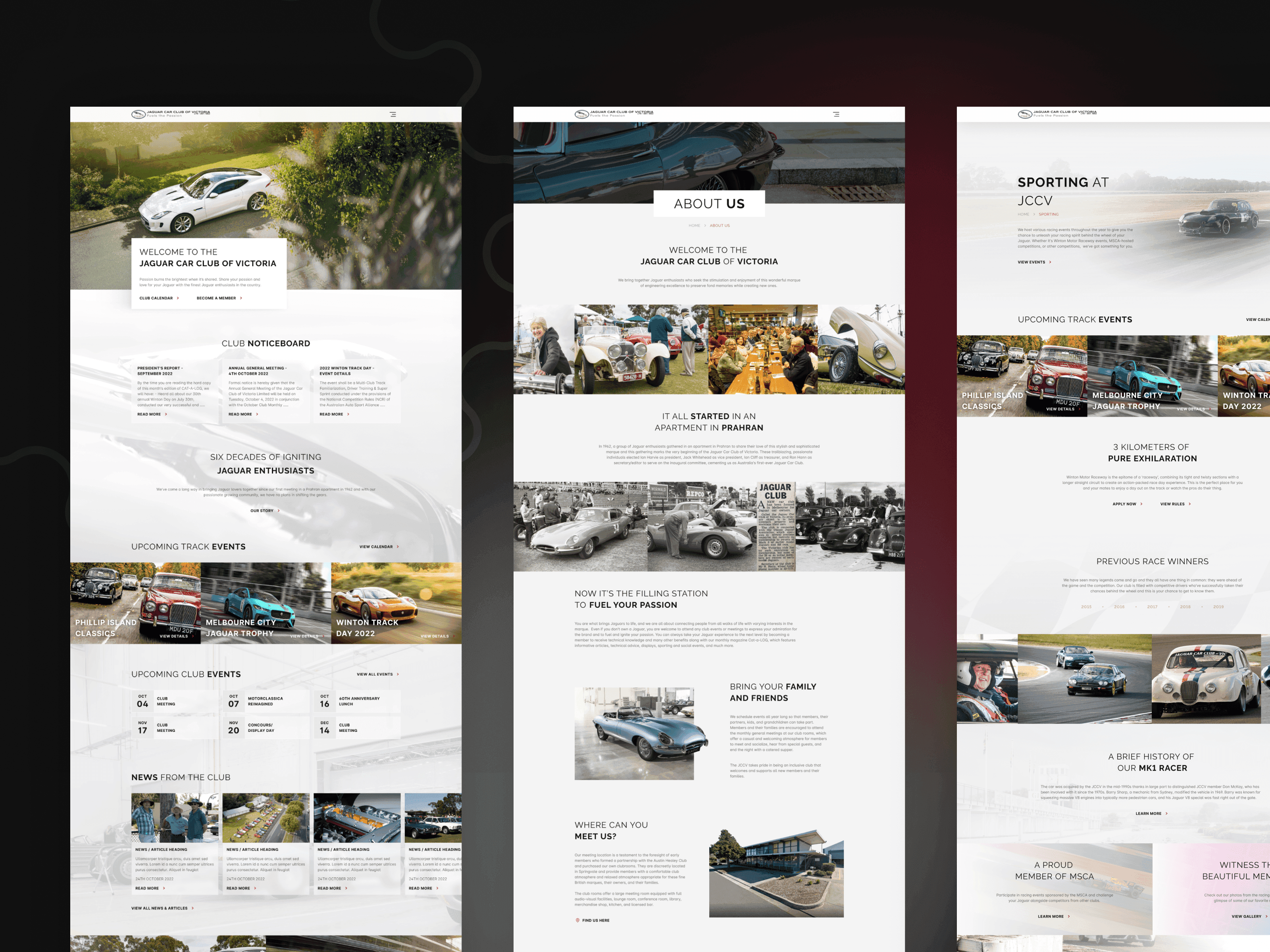
What we changed
Navigation grouped by what people come for
We cut the menu down and grouped it, so a member looking for events, news or the club's history sees a short list of places to go instead of every page at once.
Two calendars, split by event type
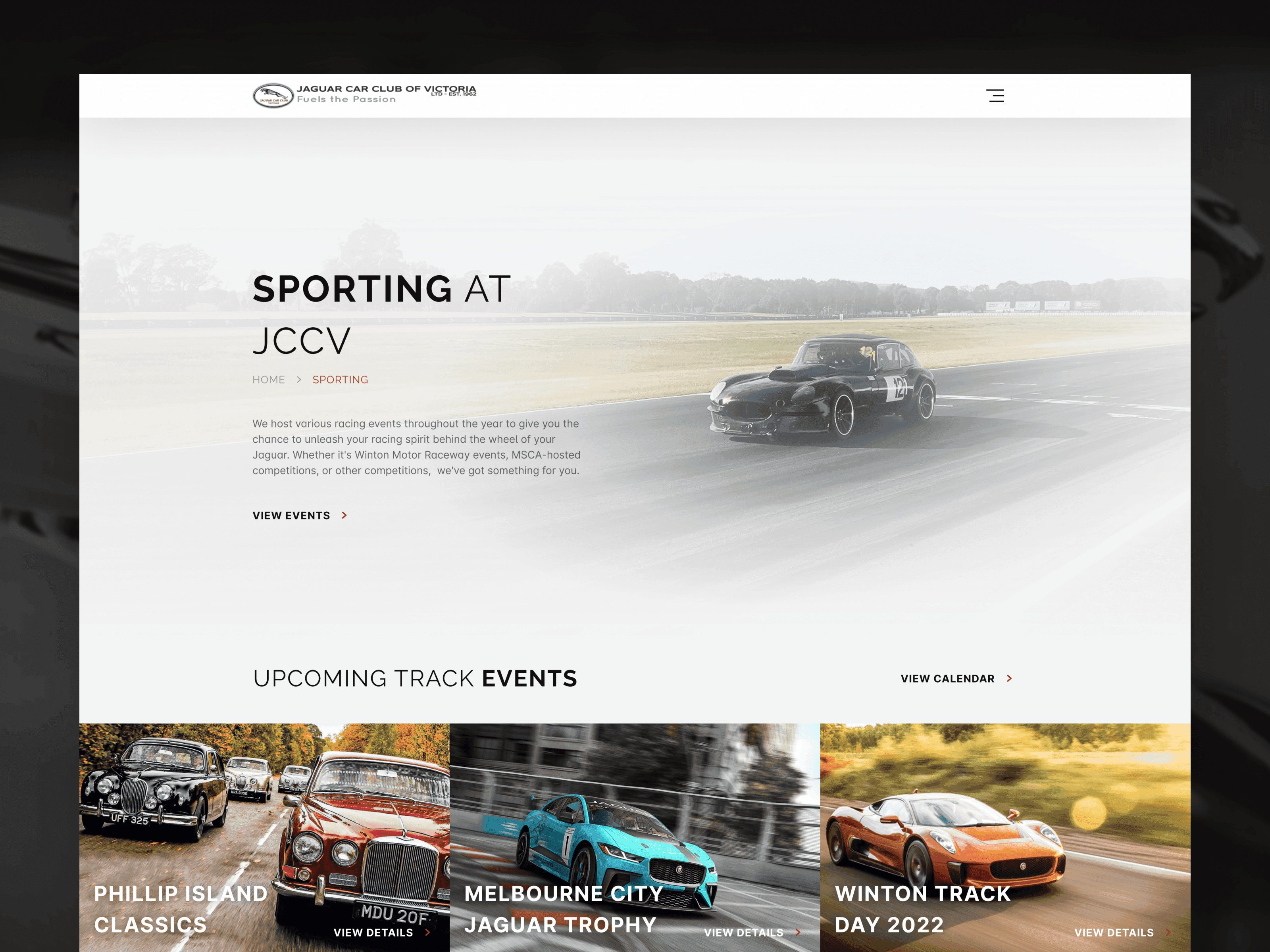
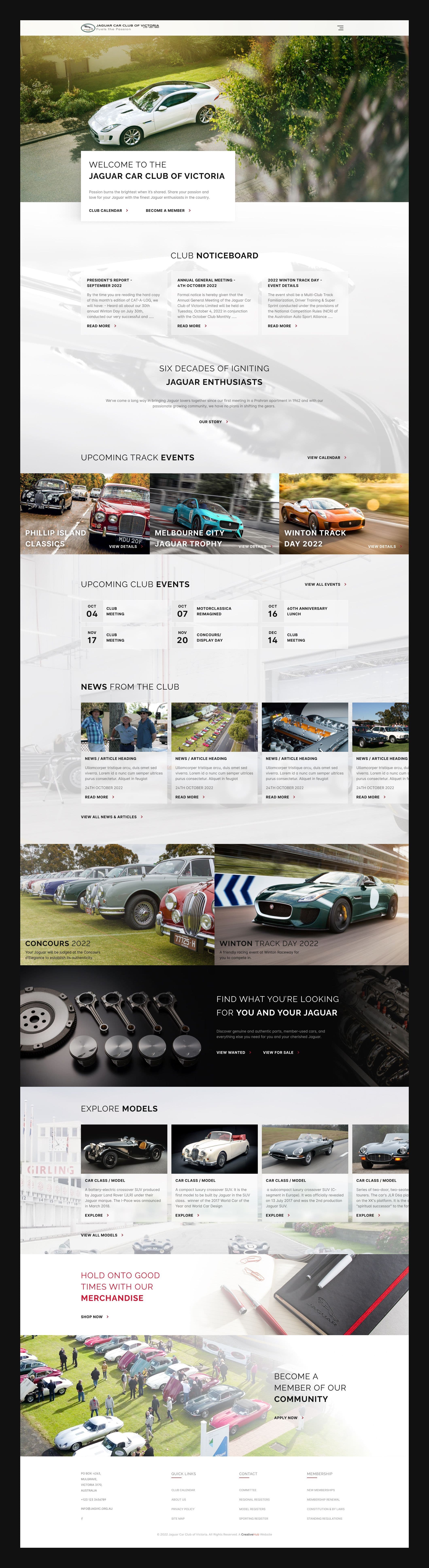
Track events and club events now have their own sections. A track day at Winton or Phillip Island gets a large photo card with View Details; club meetings, the AGM and concours days sit in a compact list of dates. Each audience scans only its own list, and the full calendar is always one click away.
A clear way to join
Become a Member sits next to Club Calendar in the hero, because those are the two things most visitors arrive for. The home page then ends with an invitation to join, right before the footer, for anyone who scrolled through the whole thing.
A footer that keeps you going
Every page now ends in a footer with a sitemap, so the bottom of a page leads somewhere instead of nowhere.
Six decades of content, given structure
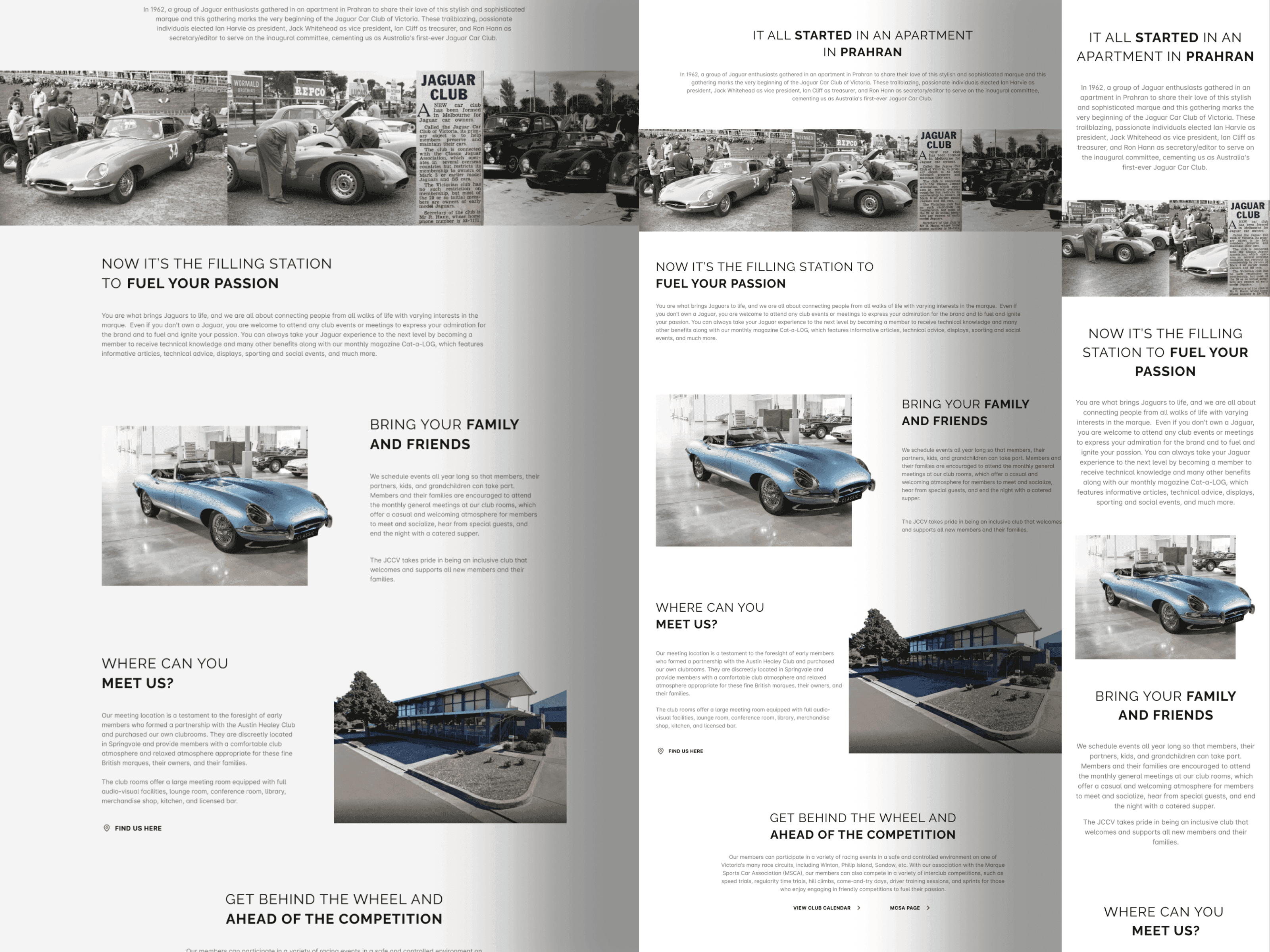
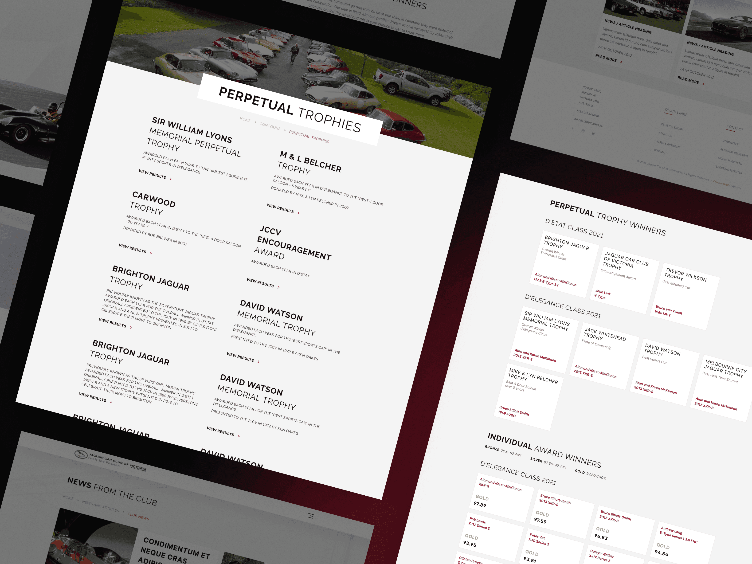
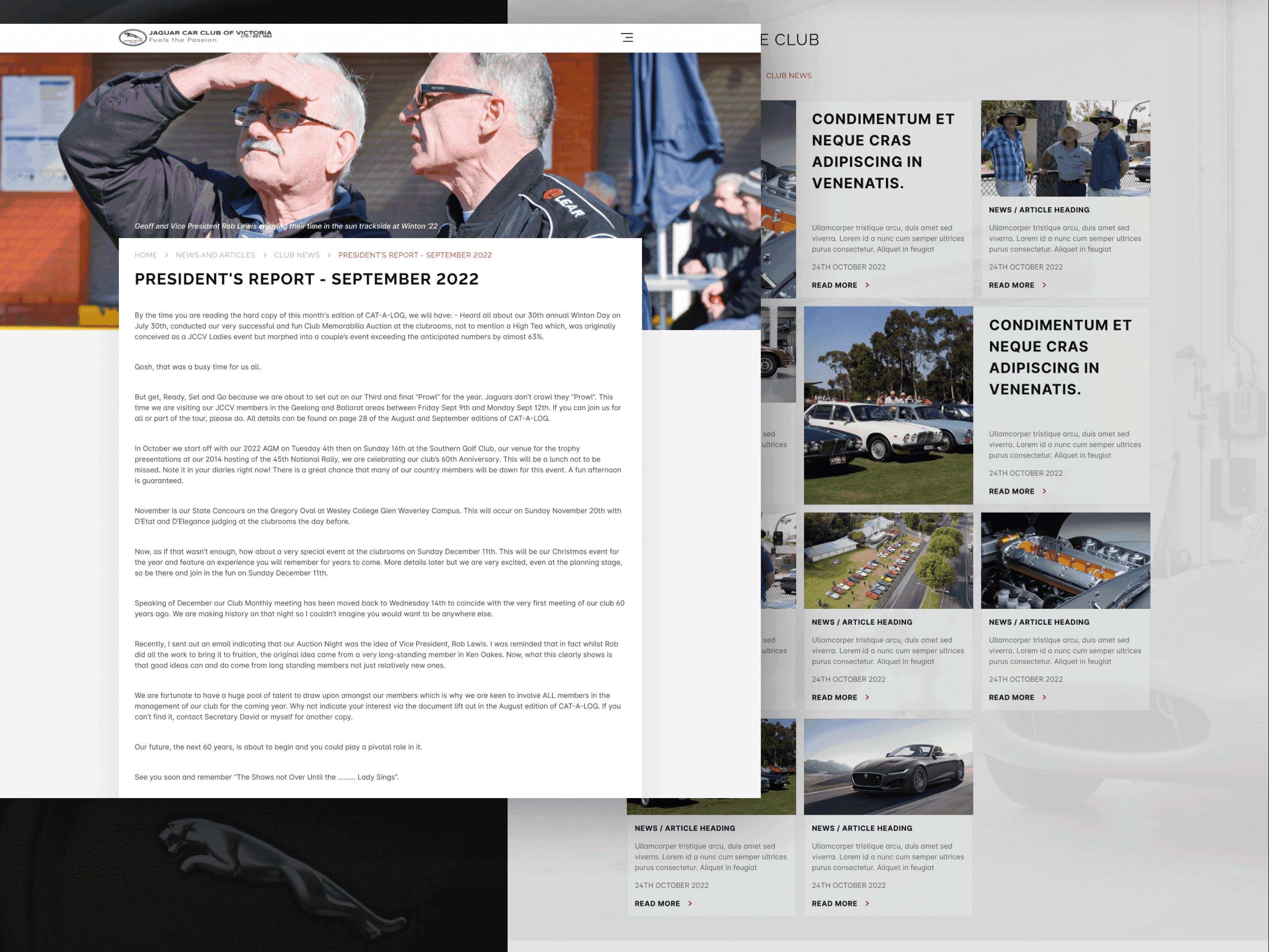
A club this old has a lot to say: its history, its perpetual trophies, results by class, and a President's Report every month. We gave long reads a single readable column, gave the trophies their own pages with the winners grouped by class, and told the club's story in short sections with archive photographs.
1 / 2
Jaguar's lines, applied to a website
Jaguar design is bold, straight lines and beautiful proportions, and the site borrows the same discipline: monochrome photography with one red accent, headings that pair a light word with a bold one, and every element aligned to a strict grid that reflows with flexbox and CSS grid on smaller screens.
The result
The redesigned site looks like it belongs to a Jaguar club and does the club's everyday jobs better: members find events by type, long reads get a proper reading layout, and anyone thinking of joining always has a way in.