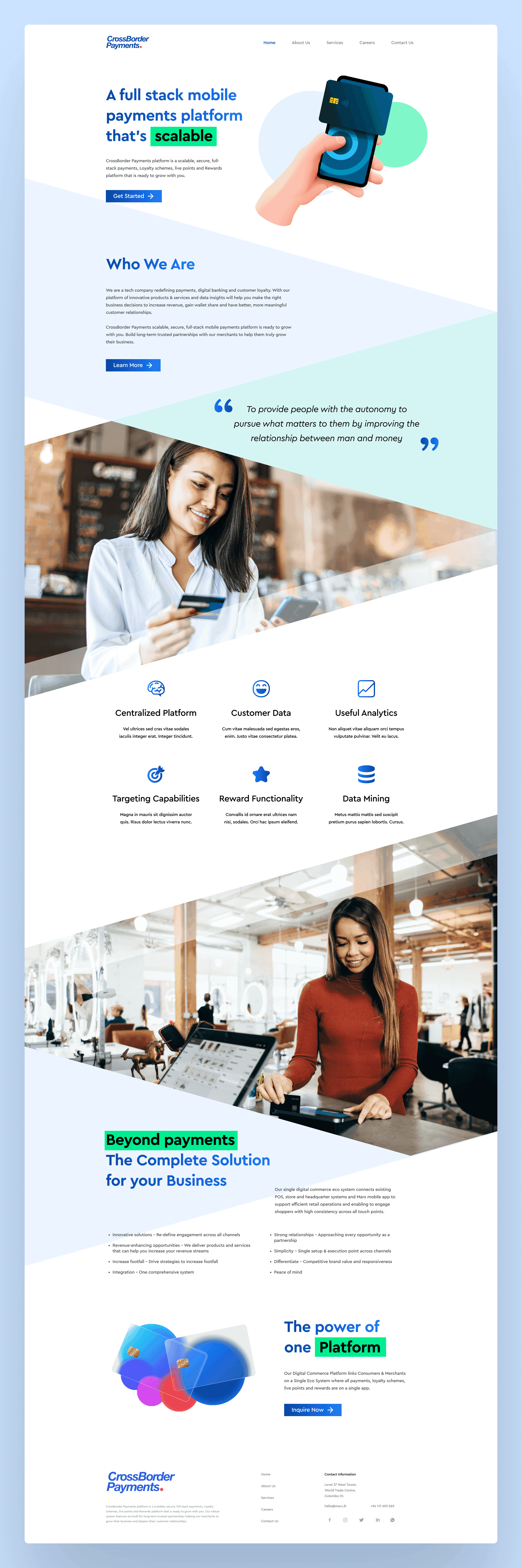
Landing Page
CrossBorder Payments: a landing page concept
A landing page concept for CrossBorder Payments, a payments platform. The job was to explain a complex product quickly, so the design leans on a clear information architecture and short, plain messaging, with blue used for the trust a payments product has to earn.
- Client
- CrossBorder Payments
- Role
- UI Designer
- Period
- 2023
- Tags
- hobby,web,concept,fintech
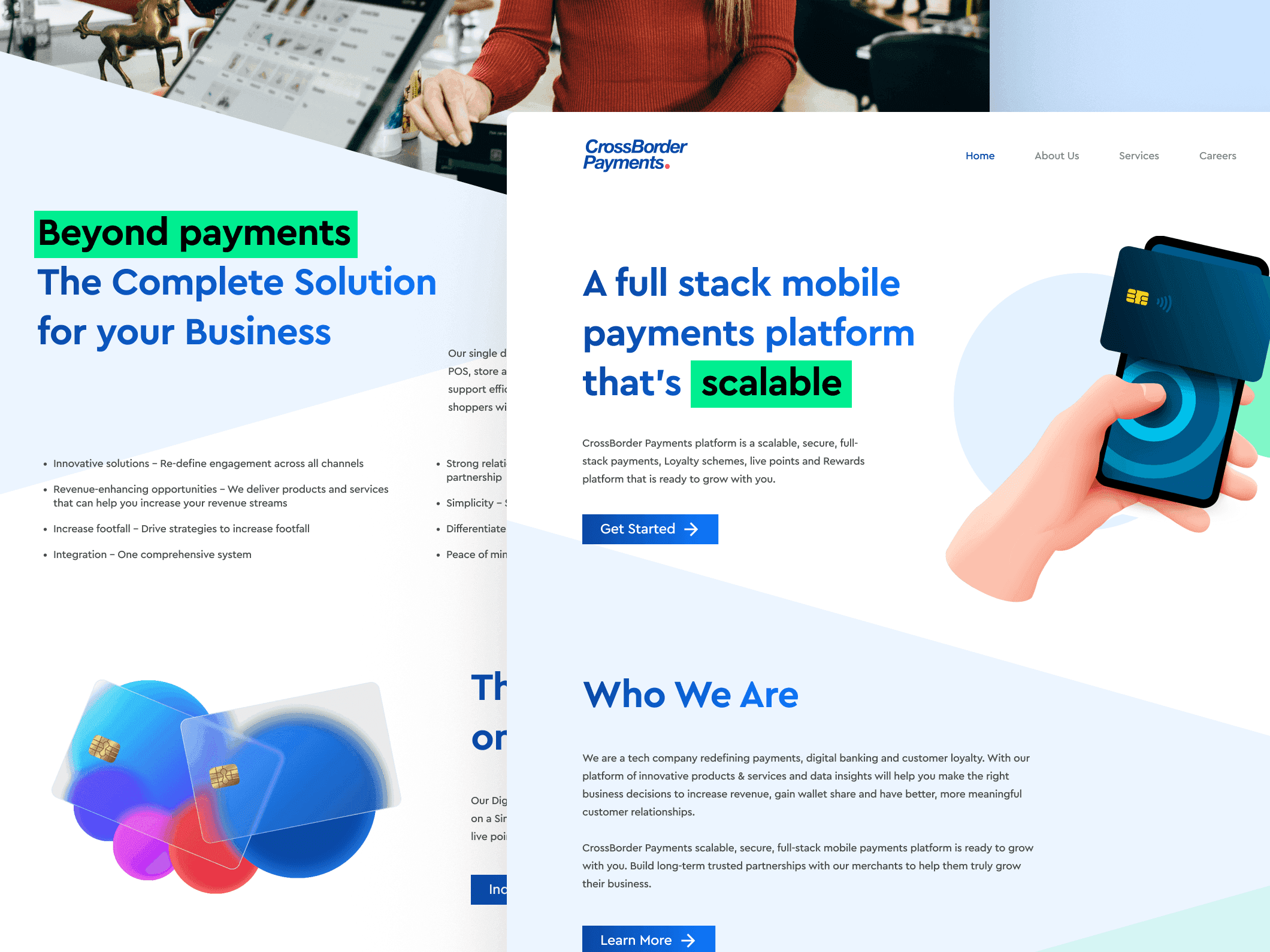
The page answers the questions in the order people ask them: what is it, who is behind it, and what does it do for my business. Each section is short, so the value of the platform comes across before anyone has to read a paragraph.
Blue was a deliberate choice. It reads as professional and dependable, which is the whole job for a product that moves other people's money.