Skip to content

Print

Designing for Humans: a book cover

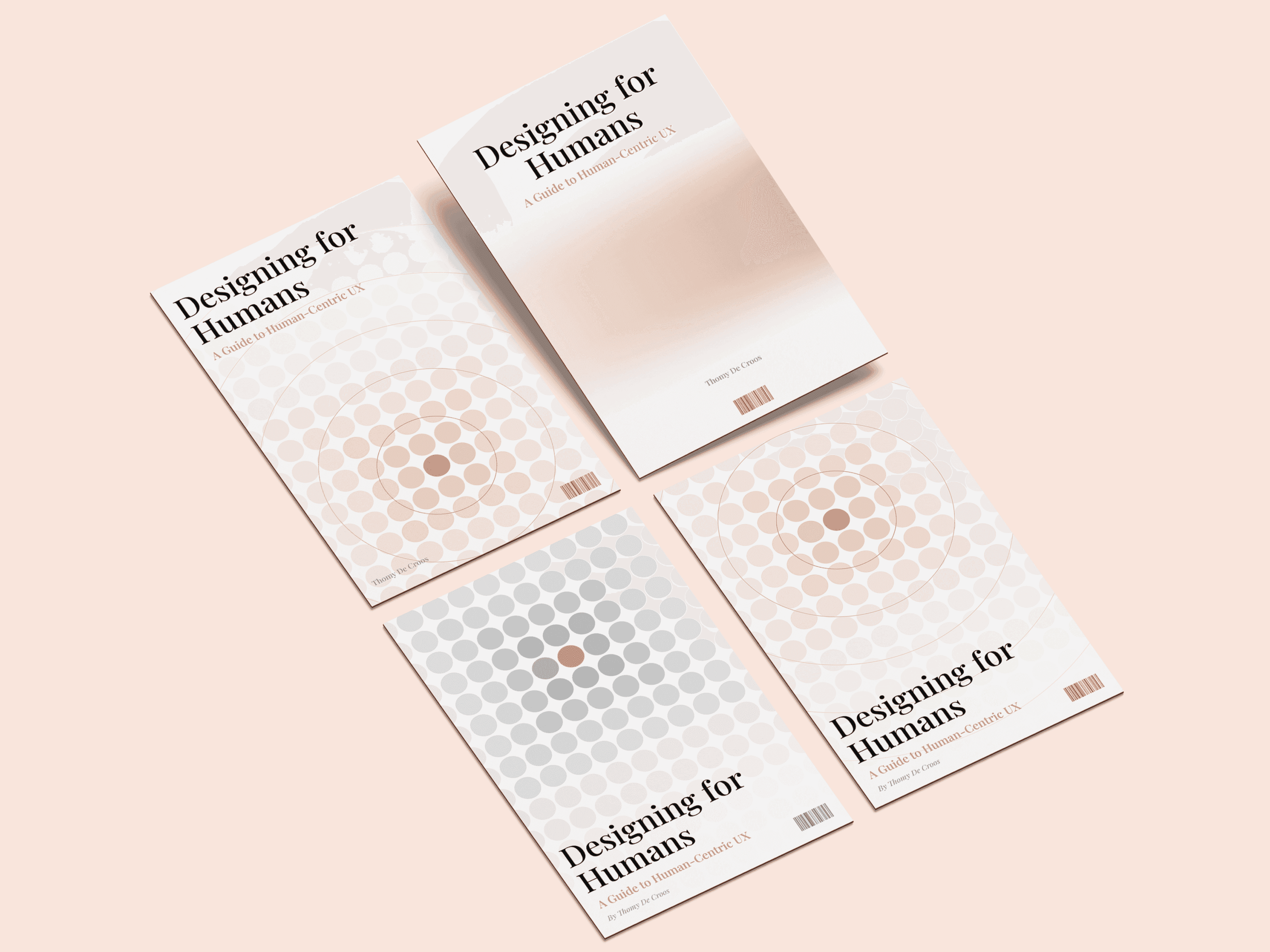
A cover for a book on human-centric UX, Designing for Humans. The design makes the subject visible: a field of dots in a range of human skin tones, with one highlighted at the centre, because designing for people means designing for all of them.

Role
Graphic Designer
Period
2023
Tags
hobby,print,brand
Four versions of the Designing for Humans cover laid flat on a pink background.

Using a range of skin tones puts inclusivity on the cover rather than in the blurb, and the highlighted dot is the person the book keeps coming back to: the one you are designing for.
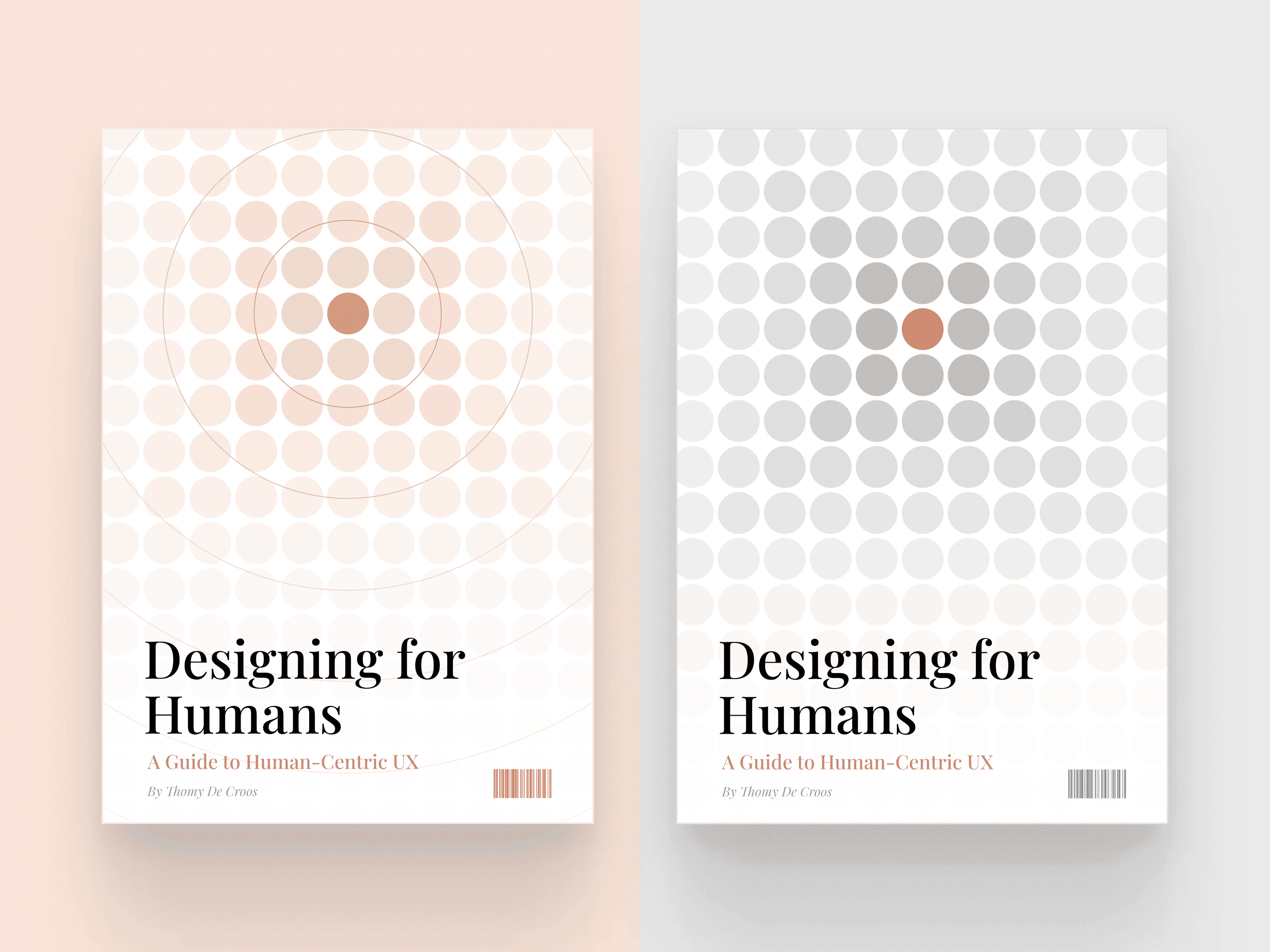

Two covers side by side, one with dots in warm skin tones and one in greys, each with a single highlighted dot.
The same idea in two palettes: every tone, and one at the centre.
  • The Designing for Humans cover with a grid of dots in skin tones radiating from a highlighted centre.
  • A grey version of the cover with one warm dot at the centre of the grid.
  • A version of the cover with the dot grid in the lower half and the title at the top.
  • A minimal version of the cover with a soft skin-tone gradient and the title at the top.

1 / 4

Variations on the grid, from the full field to a single soft gradient.

The type is bold and confident to match the book's tone, and the palette stays warm and calm, so the cover asks a question rather than shouting an answer.