Case study
UX of Datapel's warehouse management system
How I redesigned the reporting side of a B2B warehouse system so stock managers could find a report without a support call.
- Published
- 14 March 2023
- Author
- Thomy De Croos
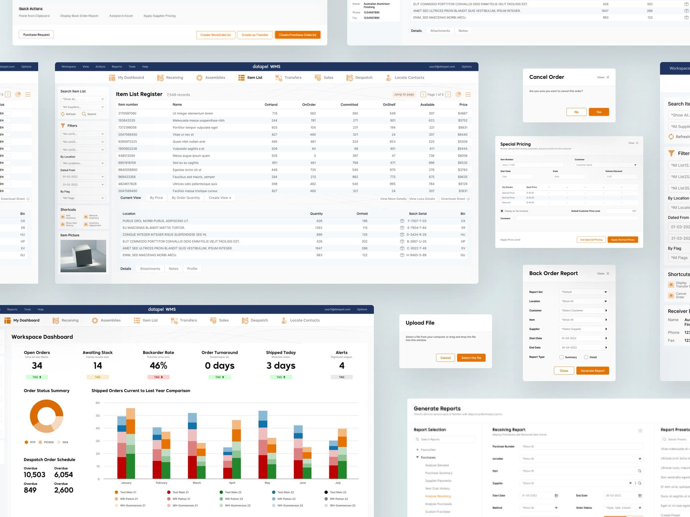
Datapel is a B2B warehouse management software (WMS) provider with an international clientele and headquarters in Australia. With features like real-time order and inventory insights, advanced stock lookup, order tracking, and integration with well-known accounting programs, their product offers effective inventory and order management.
Their challenges
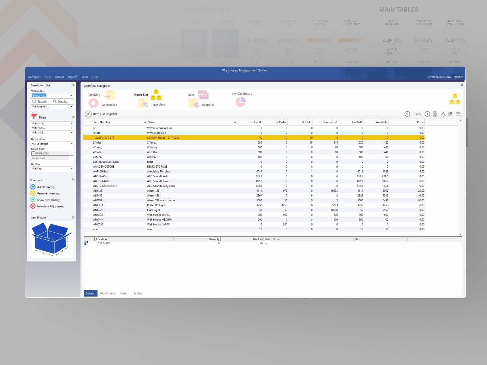
The Datapel B2B WMS UI was outdated, built around features rather than tasks, and needed a modern, user-friendly inventory management system.
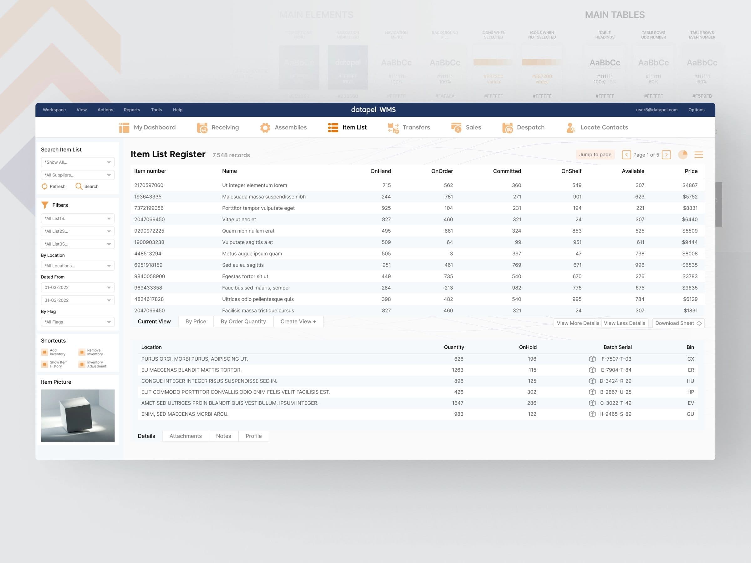
Reports and forecasting were hard to produce because the functionality was missing. Visibility was limited by the absence of visual cues, uneven emphasis on the distinct data indicators, and inconsistent access to reports.
The solution
The solution uses colour more deliberately, which makes the design easier to read. The UI was built so that a younger workforce could pick the product up without training.
By concentrating on the overall experience and design quality, the team produced something consistent across every one of the brand’s touchpoints.
The old system had clearly been built to satisfy the basic need. The new one was built to need less adaptation time and to make each function clearer.
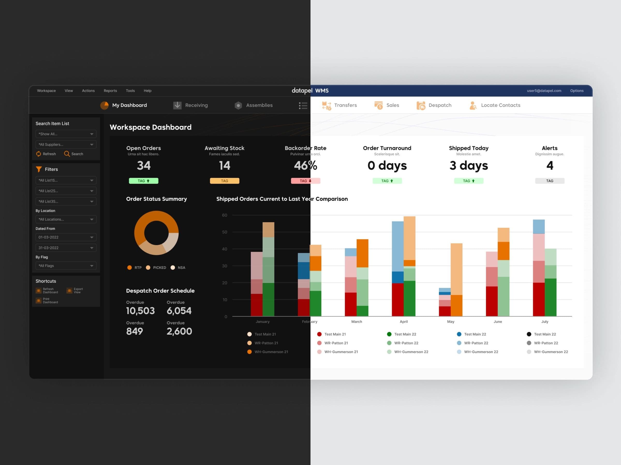
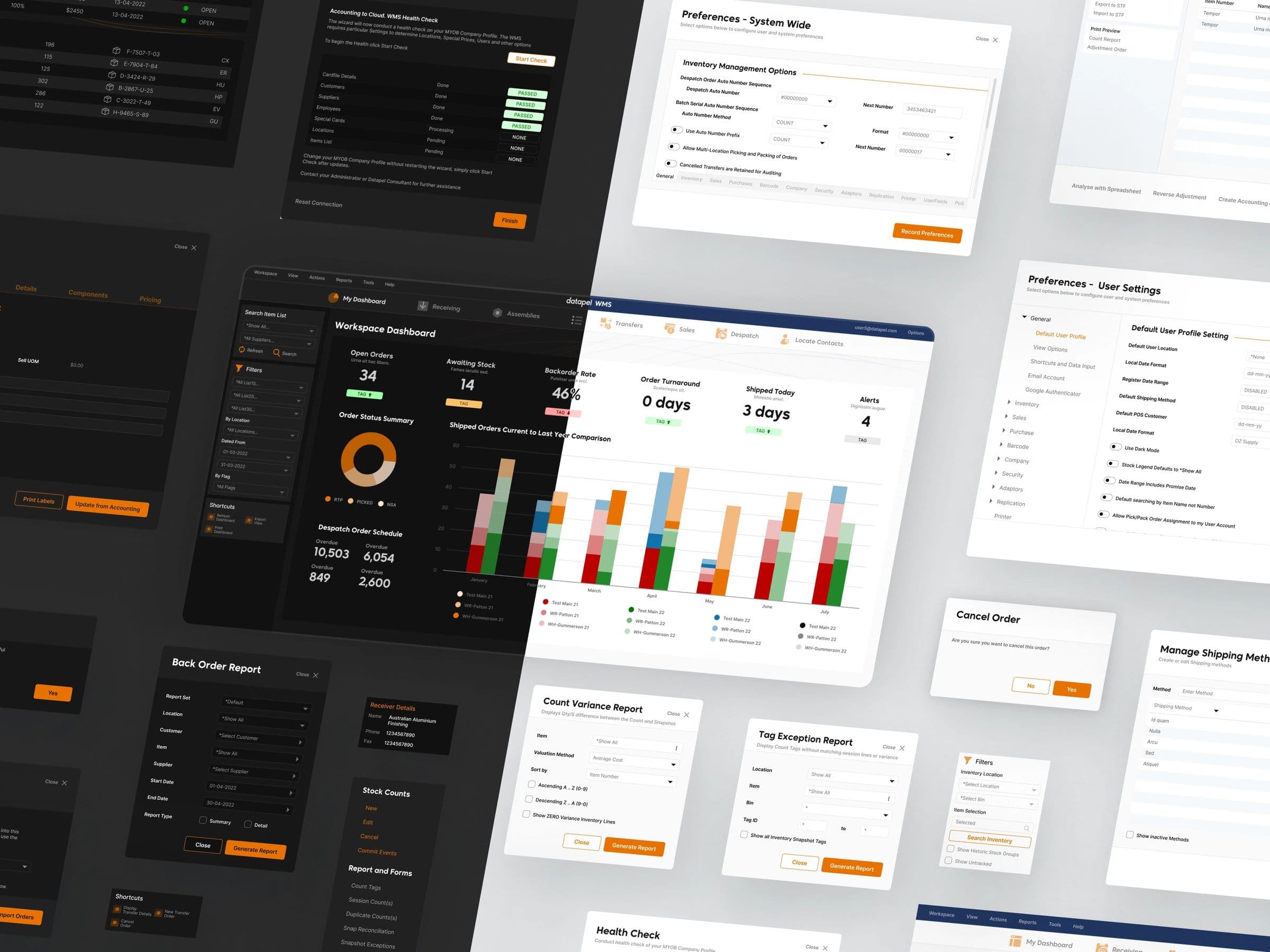
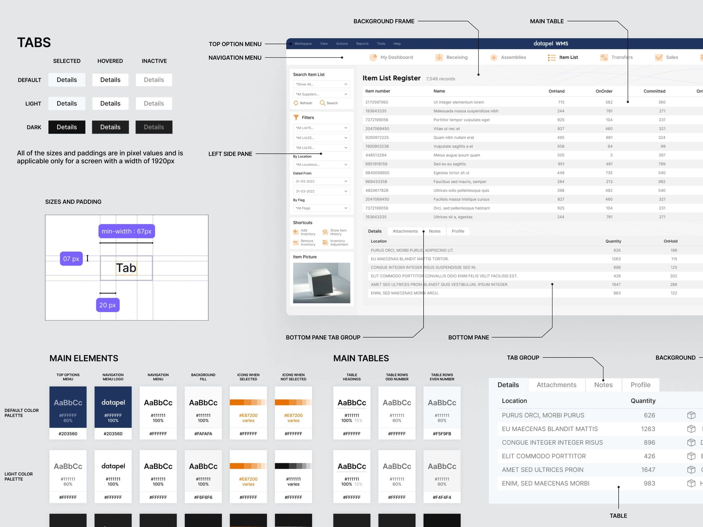
“The primary colour throughout the system is Blaze Orange. Admiral Blue sits against it as the secondary.”
Colour, icons, type
Datapel builds and reuses components, colours included, from icons through to typography. For minor elements like tags, other colours were brought in to add organisation and clarity.
Redesigning report generation
- 01
Listen
I asked the people who ran month-end what they were looking for in a report and where they gave up.
- 02
Restructure
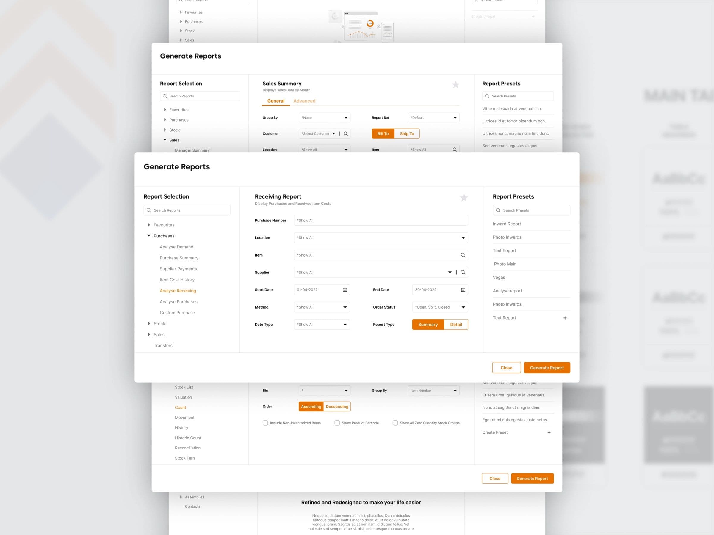
Navigation, flows and the grouping of data inside reports were reorganised around those answers.
- 03
Validate
The result was a far more direct report generation process: people found what they needed and acted on it.
What it did
I focused on the report generation experience. To make sure the redesign met the needs of actual users, I collected their feedback and used it to improve the navigation, flows and grouping of data within the reports. Finding the right information and acting on it got noticeably quicker, and satisfaction with the application went up with it.
My thanks to Creativehub Global for the opportunity to lead this project.